Brand position: A contrast strategy (70% B2B / 30% B2C)
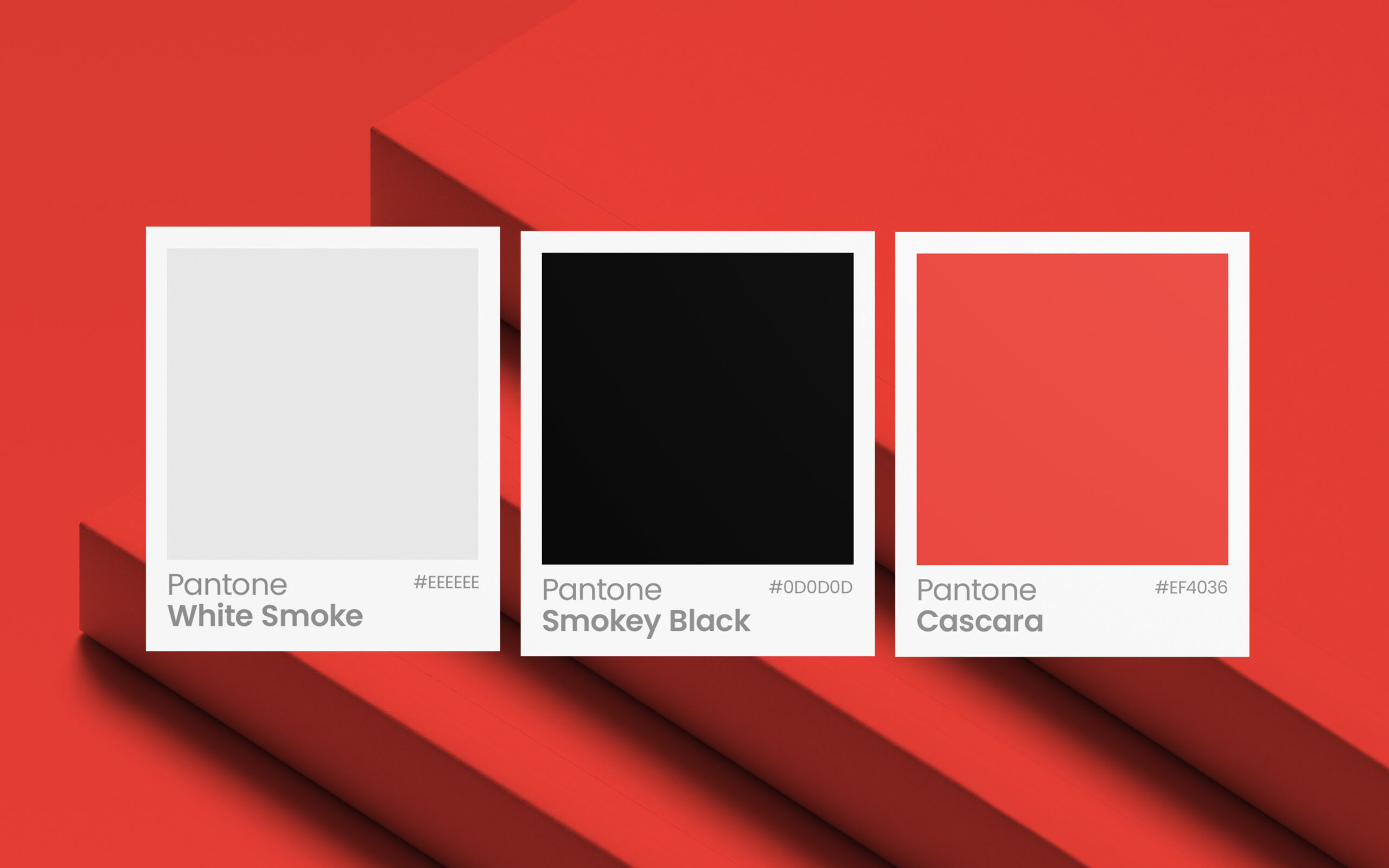
This brand, the logo, basic colour palette and typography were created along with a tone and communication strategy to be distinct in what has become a utility or commodified business category. The company offers digital printing solutions and all that comes with that from die-cutting, short to long-run reports, corporate stationary, the works.
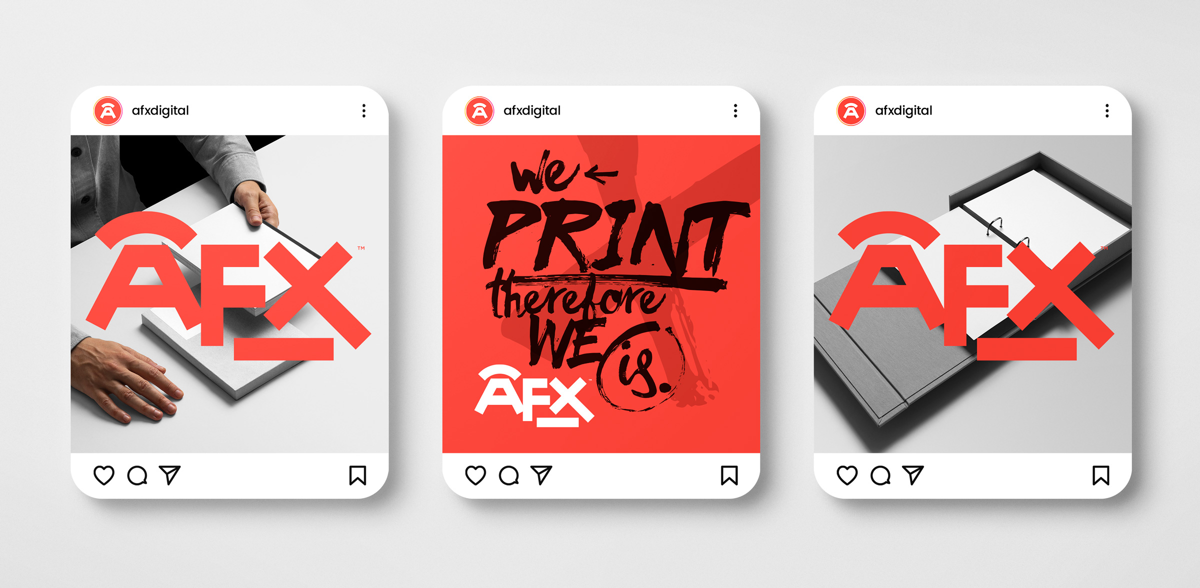
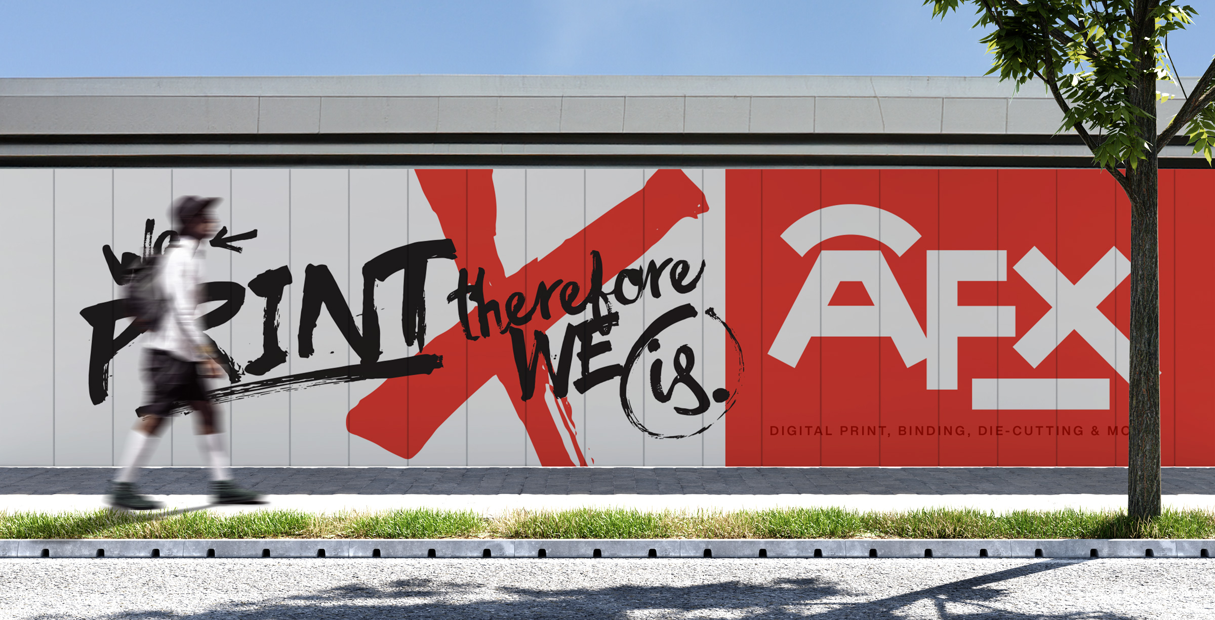
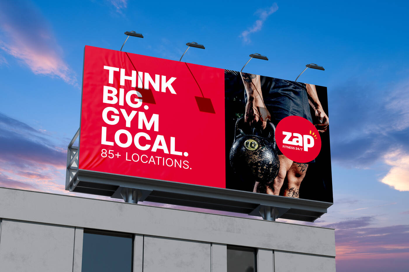
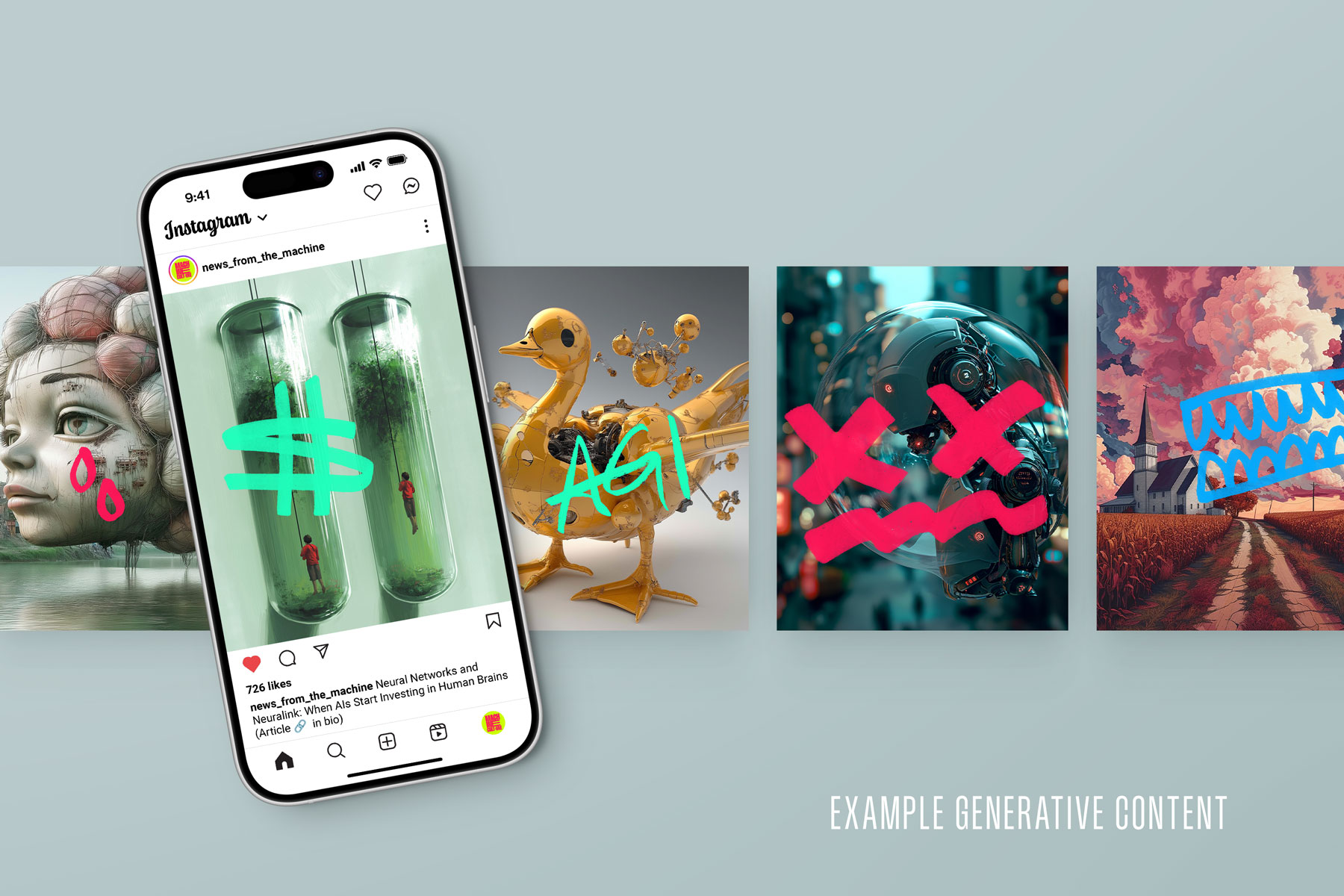
The positioning strategy was to be distinct and bold, forcing attention with contrasting visuals and messaging, balancing raw brush work and familiar but out of context phrases (modifying them to trigger a sense of interest) against geometric shapes and minimal, more corporate like language. This use of high and low art reflected the business clientele and varied output.
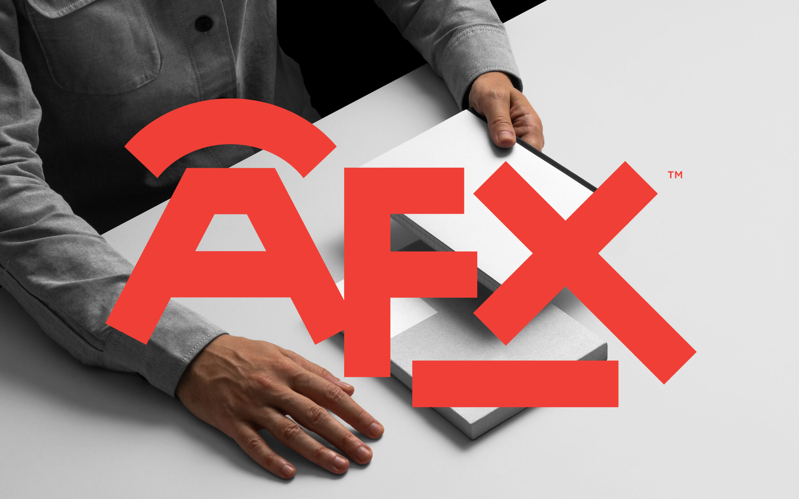
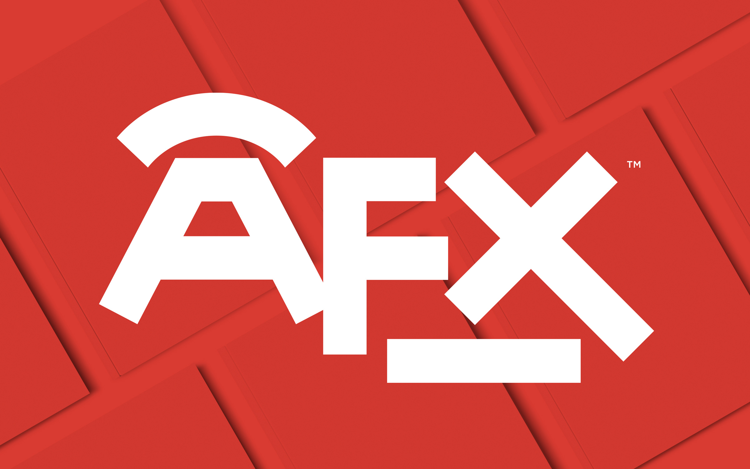
The logo shows elements of the printing press, the cylinder and the flat sheets balanced with the strong geometric letterforms.
