A new Vice-Chancellor Strategy Case Study
Task: Create brand positioning and a visual style for future Vice-Chancellor Office comms (Corporate and University), for a new Strategy and it’s awareness campaign.
Brand Positioning
To stand out from the pack in a hugely competitive marketplace the proposed brand positioning aimed at lifestyle and performance products, using Nike and ‘athleisure’ as touchstones, rather than competitor supplement brands.
Supplements are an incredibly price-sensitive and competitive category. Knowing the specific audience and brand place within sport nutrition helps focus the efforts and spend.
A new Vice-Chancellor brought a new strategy which required consideration to brand positioning and extensions, to allow a multi-channel delivery of his office’s corporate and university comms pieces, for an audience of the entire university and the wider public.
My role involved design and communication consulting along with stakeholder engagement. Proposing concepts, then roll-out the ongoing collateral to support the vision.
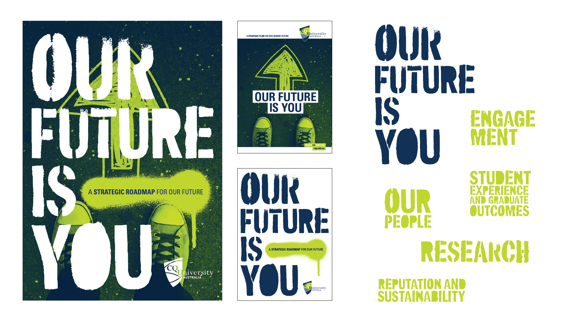
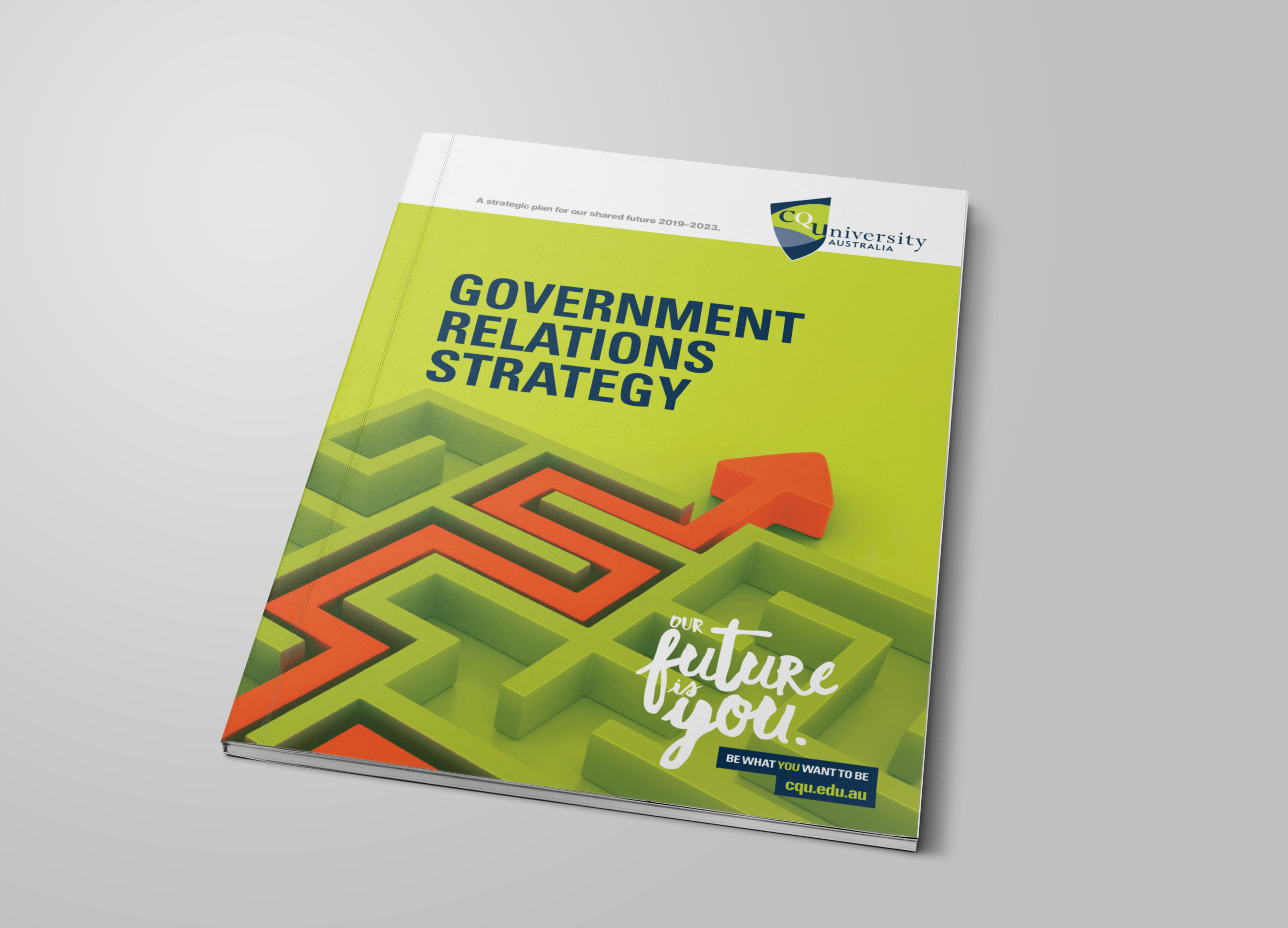
Included in my deliverables: copywriting, naming the overall strategy (‘The Future Is You’), creative concepts as a brand positioning extension and delivery of print, presentation, video and social content assets as and when required.
A fresh visual style for both the VCs office and the overarching Strategy.
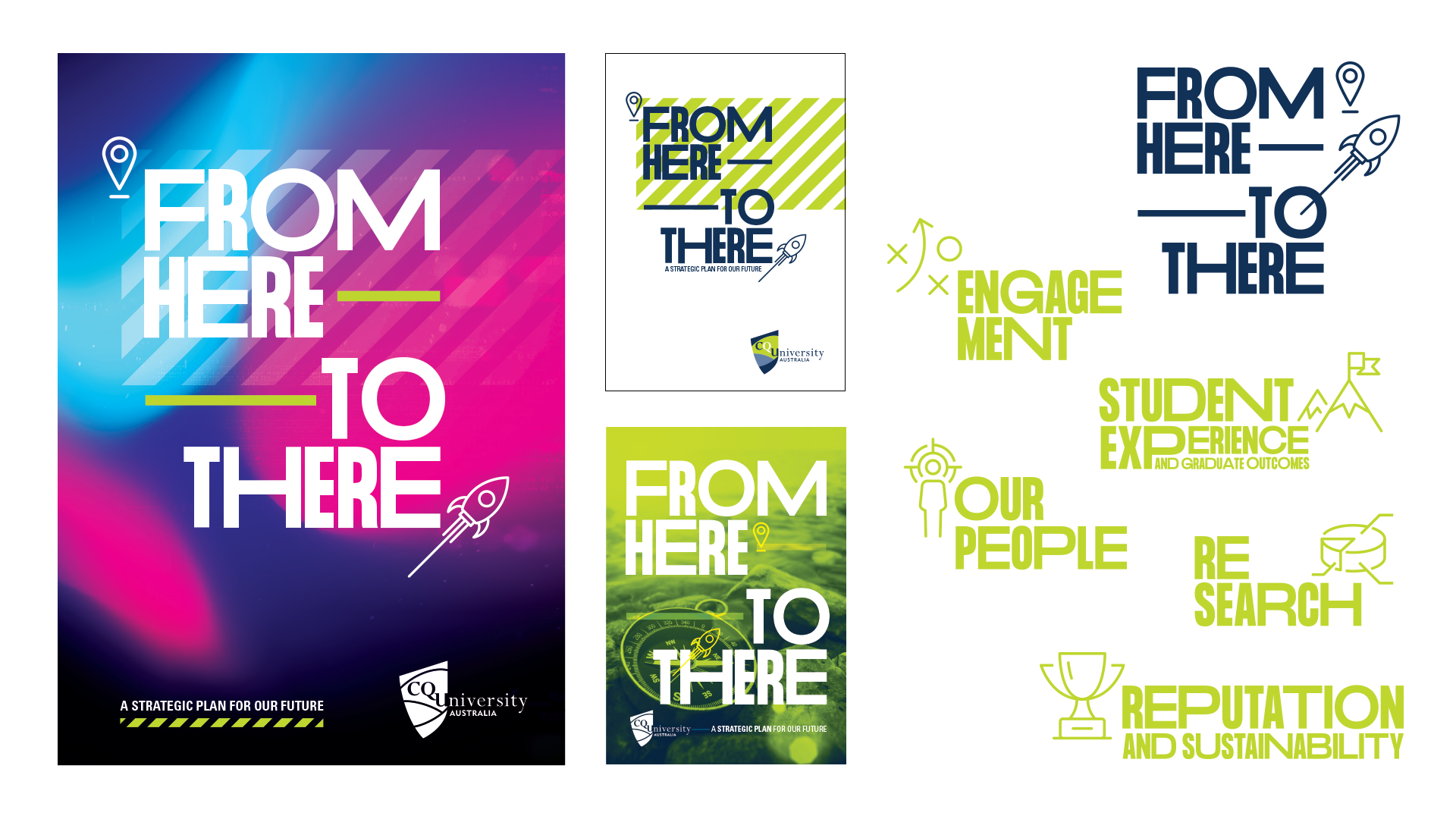
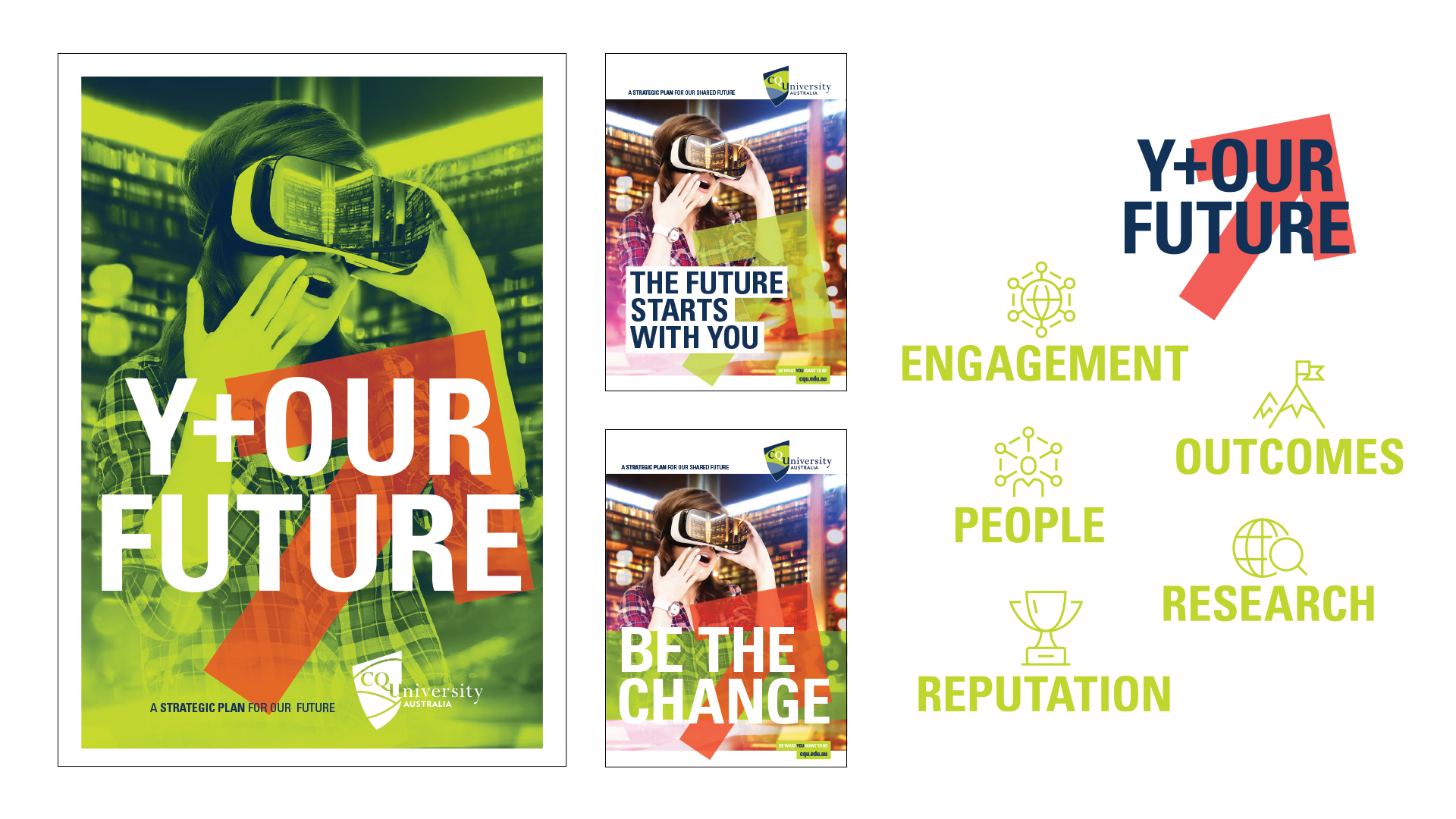
Creative Direction Concepts
The brief asked for a new way of presenting the University brand, an extension which positions itself as warm, friendly and most importantly a fresh visual style.
My strategy with concepts when given a fairly broad brief is to give distinct directions in the visual style. This way you are able to triangulate what the stakeholder feels is the right direction, if they in fact have a preference.
This visual experimentation helps you and the stakeholder / client begin to understand the project more and offers a place to discuss and hone the vision.
Strategic Pillars and overall thematic
Brand Positioning and Semiotics
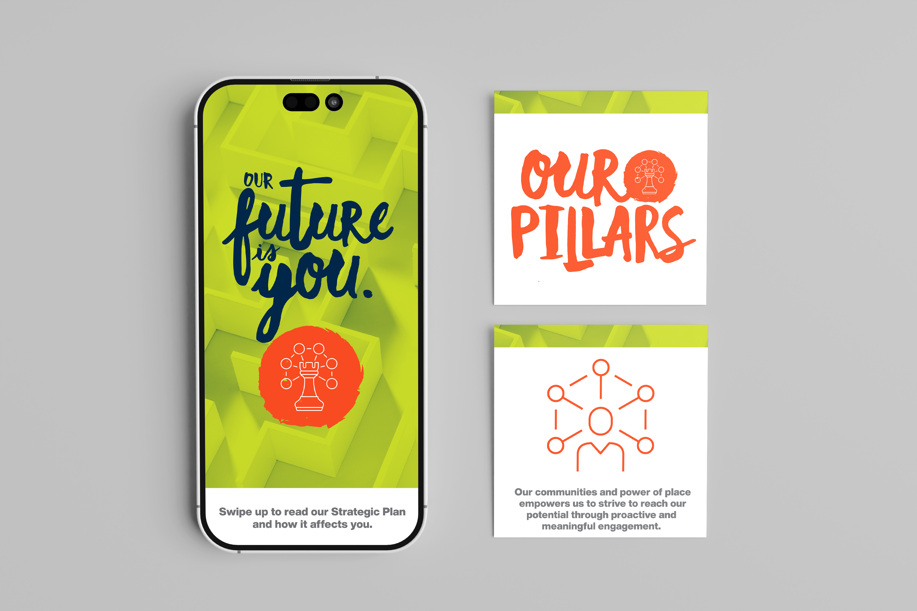
The Strategy used 5 structural pillars. These gave focus to the main areas of the University community.
This project asked for 2 brand extensions. 1 was a new, cleaner direction for the VCs office, allowing the communication from his office to be modern, while still clearly part of the existing brand.
The 2nd was a direction for the pillars themselves, allowing the implementation of the Strategy to have a separate yet connected visual style.
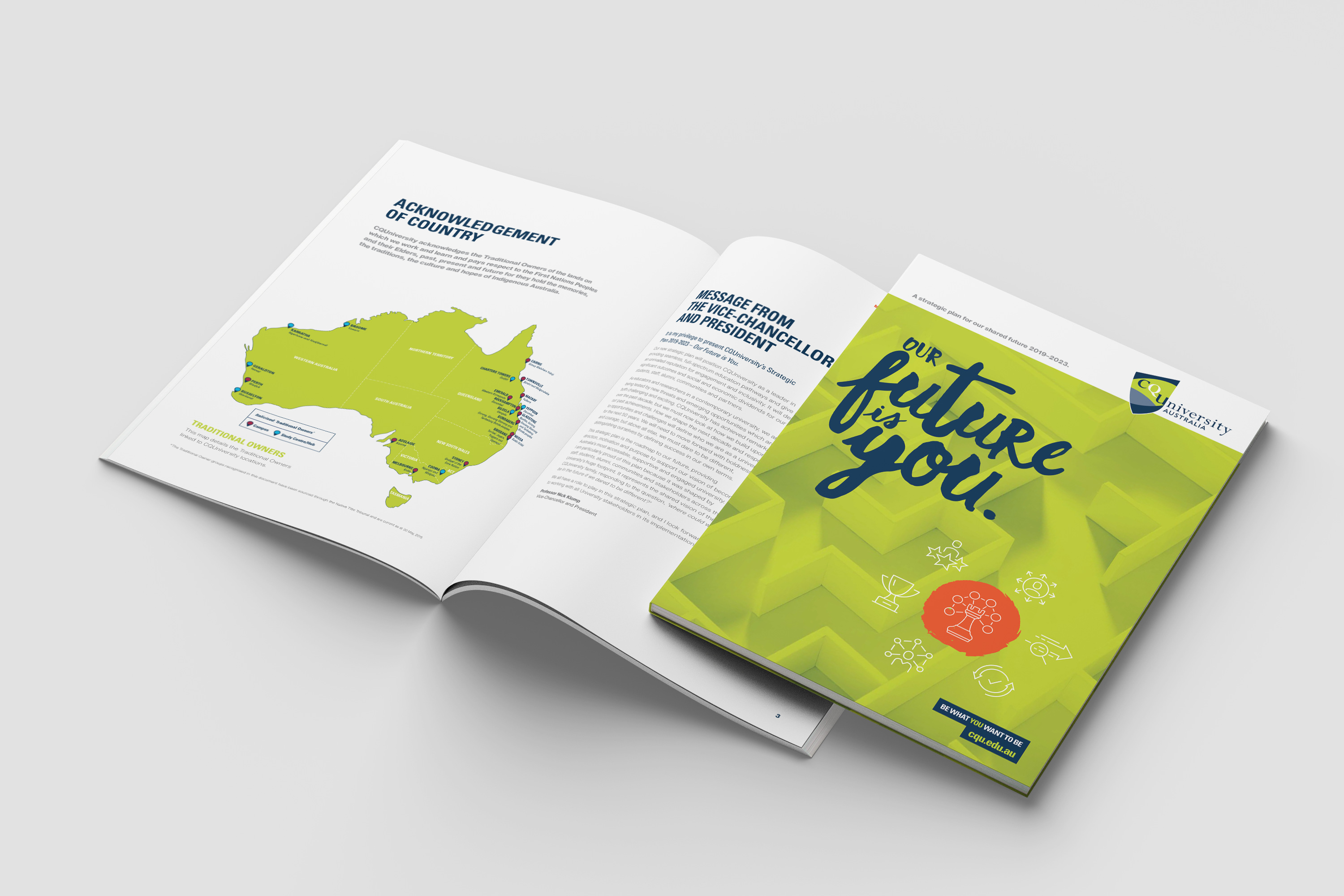
As shown here, the pillars used a friendly handwritten typography solution, coupled with a modern online icon set which I had standardised across the University.
Additionally the maze background images was used to link the idea of strategy and finding our way through uncertain times.
Further Extensions
This visual style allowed related University comms pieces to build on the messaging of strategic leadership.
This new style allowed a modern and clean design to reach across the Vice-Chancellor office comms. The style allowed for a mixture of friendly while still professional messaging and felt strongly of itself. Completely standing alone in the Australian university space.
The outcome and visual future of the brand.
Straddling consistency and evolution
This project was very embraced by both the University community and the external stakeholders. The approach allowed the VCs office to deliver corporate communications in a friendly and unique way while still feeling and presenting strongly inside the University brand.
One of the skills required when brand managing or guiding is to understand how to be both consistent to a brand while still evolving it. This was one of this projects that introduced a completely new visual language to the brand while at the same time strengthening and reinforcing the existing core brand.

